Using color psychology in web design is a powerful way to influence the emotions and perceptions of your website visitors. Different colors can evoke different emotions and feelings, and understanding how to use them effectively can help create a positive emotional response.
Here’s how you can use color psychology in web design to achieve this:
Understand Color Associations
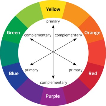
Research the psychological associations commonly attributed to different colors. For example:
- Red: Excitement, passion, love, urgency
- Blue: Trust, calmness, professionalism
- Green: Health, nature, growth
- Yellow: Happiness, optimism, warmth
- Purple: Luxury, creativity, spirituality
- Orange: Energy, enthusiasm, friendliness
Contrast and Hierarchy
Contrast and hierarchy are essential principles in web design that play a significant role in guiding users’ attention, improving readability, and enhancing the overall user experience.
Here’s a closer look at these two concepts:
Contrast
- Definition: Contrast refers to the difference in visual properties, such as color, size, texture, or shape, between two or more elements on a web page.
- Purpose: The primary purpose of contrast is to create emphasis and make certain elements stand out. It helps users quickly identify important information and calls to action.
Examples:
- Use a bold or vibrant color for a call-to-action button against a more muted background.
- Increasing the font size and weight for headlines compared to body text.
- Employing high contrast in text and background colors to enhance readability.
Hierarchy
- Definition: Hierarchy in web design refers to organizing and arranging elements on a web page to convey their relative importance.
- Purpose: Hierarchy guides users through the content and helps them understand the structure of the information presented. It ensures that users focus on the most critical elements first.
Examples:
- Placing the website logo or brand name prominently at the top of the page to establish brand identity.
- I am using larger headings (H1, H2, H3, etc.) to structure content, with H1 being the most important and H3 or H4 for subheadings.
- Grouping related navigation links together in a navigation menu or sidebar to distinguish them from regular text.
Create a Color Palette
Creating a color palette for your web design involves selecting a set of colors that will be used consistently across your website to convey your brand’s personality and evoke specific emotions.
Here’s a step-by-step guide to help you create a color palette:
Understand Your Brand:
- Start by understanding your brand’s identity, values, and the emotions you want to convey. What is the personality of your brand? Is it bold and energetic or calm and professional?
Research Color Associations:
- Research the psychological associations commonly attributed to different colors (as mentioned earlier in this conversation). Consider how these associations align with your brand.
Primary Color Selection:
- Choose a primary color that represents the core personality of your brand. This color will likely dominate your design.
- Consider factors like the emotions associated with the color and how well it aligns with your brand identity.
Discover more from Wits Technologies Ltd
Subscribe to get the latest posts sent to your email.
- Checklist: Monthly Website Maintenance for Peak Performance

- LinkedIn Ads vs Instagram Reels: Where Should You Invest in 2025?

- The Death of Cookies; What Digital Marketers Need to Do Now

- How AI is Revolutionizing Automated Web Maintenance

- Fix It Before It Breaks: Preventive Maintenance Strategies for Websites
