UI/UX (User Interface/User Experience) design plays a crucial role in creating engaging websites. It focuses on enhancing the usability, accessibility, and overall user satisfaction of websites.
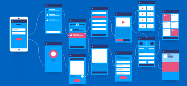
UI/UX design refers to the process of creating user interfaces and user experiences for digital products such as websites, mobile applications, software, and other interactive platforms. It encompasses the visual design, interaction design, information architecture, and overall user flow to ensure that the product is usable, accessible, and provides a positive experience for its users.
UI (User Interface) design focuses on the visual elements and aesthetics of the digital product. It involves designing the layout, colors, typography, icons, and other visual elements that users interact with on the screen. The goal is to create an interface that is visually appealing, consistent, and easy to understand, allowing users to navigate and interact with the product efficiently.
UX (User Experience) design, on the other hand, concentrates on the overall experience that users have while interacting with the digital product. It involves understanding users’ needs, goals, and behaviors to create a design that is user-centered and intuitive. UX designers focus on enhancing the usability, accessibility, and satisfaction of the product, ensuring that it meets the expectations and requirements of the target users.
Here are some key ways in which UI/UX design contributes to creating engaging websites:
Usability and Intuitive Navigation
Usability and intuitive navigation are critical aspects of UI/UX design that contribute to creating engaging websites.
Let’s explore these concepts further:
- Usability: Usability refers to the ease with which users can interact with a website and accomplish their goals effectively and efficiently. A usable websites ensures that users can easily understand and navigate through its content, features, and functionalities.
Key considerations for usability include:
- Learnability: Users should be able to quickly understand how to use the website and its various elements without requiring extensive instructions or assistance.
- Efficiency: Users should be able to perform tasks and access information quickly, minimizing the time and effort required to achieve their objectives.
- Memorability: Once users have learned how to use the website, they should be able to remember its features and navigation paths to facilitate future interactions.
- Error prevention and recovery: The website should be designed to minimize user errors through clear instructions, feedback mechanisms, and error-handling techniques that enable users to recover easily from mistakes.
- Consistency: The website should maintain consistency in terms of layout, labeling, and interaction patterns across its pages and sections, promoting familiarity and reducing cognitive load for users.
- Intuitive Navigation: Intuitive navigation refers to the design of a website’s navigation system in a way that feels natural and easy for users to understand and follow. It involves organizing information and creating clear pathways for users to navigate through the website.
Key considerations for intuitive navigation include:
- Clear menu structure: The website should have a well-organized and easily accessible menu that clearly indicates the available sections and content.
- Logical information architecture: The website’s content should be structured and grouped logically, making it easy for users to find the information or features they are looking for.
- Breadcrumbs: Breadcrumbs provide users with a hierarchical navigation trail, showing their current location within the website’s structure. They help users understand the website’s organization and enable easy backward navigation.
- Search functionality: A search feature allows users to quickly find specific content or features by entering relevant keywords. It is especially useful for websites with extensive or complex content.
- Call-to-action (CTA) buttons: Well-designed and prominently placed CTA buttons guide users toward important actions, such as making a purchase, subscribing, or contacting the business.
Visual Appeal and Branding
Visual appeal and branding are essential aspects of UI/UX design that contribute to creating engaging websites.
Let’s delve into these concepts further:
- Visual Appeal: Visual appeal refers to the aesthetic aspects of a website’s design that catch the user’s attention, evoke positive emotions, and create a pleasant experience. Key considerations for visual appeal include:
- Color scheme: Choosing an appropriate color palette that aligns with the website’s purpose, target audience, and brand identity. Colors can evoke specific emotions and influence user perception.
- Typography: Select suitable fonts that are easy to read, visually pleasing, and consistent with the overall design aesthetic. Typography also plays a role in conveying hierarchy and organizing content.
- Imagery and graphics: Using high-quality images, illustrations, icons, and other visual elements that enhance the visual appeal of the website. These visuals can contribute to storytelling, convey information, and create a cohesive visual experience.
- Layout and spacing: Creating a balanced and visually pleasing layout that utilizes white space effectively. Proper spacing between elements improves readability and ensures a clutter-free design.
- Visual hierarchy: Establishing a clear visual hierarchy to guide users’ attention and prioritize important content. This involves using size, color, contrast, and placement to highlight key elements and create a logical flow.
- Branding: Branding involves incorporating the organization’s brand identity and personality into the website’s design to create a consistent and recognizable experience.
Key considerations for branding include:
- Logo and brand elements: Showcasing the organization’s logo and incorporating brand elements such as colors, typography, and visual motifs to reinforce brand recognition and consistency.
- Tone and voice: Using appropriate language, tone, and messaging that aligns with the brand’s personality and target audience. Consistency in communication helps establish a cohesive brand experience.
- Visual style: Applying design elements and visual treatments that reflect the brand’s visual identity, whether it’s minimalistic, bold, playful, or sophisticated. Consistency in visual style reinforces brand recognition and strengthens the brand association.
- Storytelling: Using design elements, imagery, and content to convey the organization’s values, mission, and unique selling points. Effective storytelling creates an emotional connection with users and reinforces brand identity.
Responsive and Mobile-Friendly Design

Responsive and mobile-friendly design is a crucial aspect of UI/UX design that contributes to creating engaging websites. With the increasing use of mobile devices, it is essential to ensure that websites adapt seamlessly to different screen sizes and provide an optimized experience across platforms.
Let’s explore responsive and mobile-friendly design further:
- Responsive Design: Responsive design is an approach to web design that enables a website to automatically adjust its layout and content based on the device and screen size it is viewed on.
Key considerations for responsive design include:
- Fluid grids: Using relative units like percentages rather than fixed pixels to create flexible and proportionate layouts that can adapt to different screen sizes.
- Flexible images and media: Employing techniques like CSS media queries to resize and adapt images and media elements to fit different devices, preventing them from being too large or small.
- Breakpoints: Identifying specific screen widths at which the layout needs to adapt and adjusting the design accordingly. This ensures optimal presentation and usability across different devices.
- Content prioritization: Prioritizing and reorganizing content to display the most important information prominently on smaller screens, while still providing access to additional content when needed.
- Mobile-Friendly Design: Mobile-friendly design specifically focuses on creating an optimal user experience for mobile devices. It involves considering the unique characteristics and constraints of mobile devices, such as smaller screens, touch interactions, and varying network speeds.
Key considerations for mobile-friendly design include:
- Touch-friendly interface: Designing buttons, links, and interactive elements with adequate size and spacing to accommodate touch interactions accurately and prevent accidental taps.
- Streamlined navigation: Simplifying navigation by using collapsible menus, hamburger icons, or other mobile-specific patterns to save screen space and provide a smooth browsing experience.
- Performance optimization: Optimizing the website’s performance by minimizing file sizes, reducing server requests, and implementing caching techniques to ensure faster loading times and smoother browsing on mobile networks.
- Content optimization: Condensing and prioritizing content for mobile devices, ensuring it is concise, scannable, and easily digestible on smaller screens. This helps users access information quickly without excessive scrolling or zooming.
- Mobile forms: Designing forms that are mobile-friendly, with simplified input fields, auto-fill suggestions, and validation messages that are clear and easy to understand on small screens.
Interaction and Feedback
Interaction and feedback are crucial aspects of UI/UX design that contribute to creating engaging websites. They involve designing interactive elements and providing feedback to users, creating a sense of responsiveness and control.
Let’s explore interaction and feedback further:
- Interactive Elements: UI/UX designers incorporate interactive elements to engage users and encourage active participation.
These elements can include:
- Buttons and links: Well-designed buttons and links enable users to interact with the website, navigate to different pages, perform actions, or submit forms.
- Forms and input fields: Interactive forms allow users to provide information, make selections, and submit data. Designing forms with clear labels, validation, and error handling enhances the user experience.
- Sliders, toggles, and other controls: Interactive controls allow users to adjust settings, switch between options, or manipulate content dynamically. These elements provide users with a sense of control and personalization.
- Carousels, image galleries, and sliders: These interactive components enable users to view and explore multiple images or pieces of content in a visually appealing and engaging manner.
- Interactive maps or charts: Incorporating interactive maps or charts allows users to explore data, locations, or visual representations in an interactive and dynamic way.
- Feedback and Response: Providing feedback on user actions is essential for creating a responsive and engaging experience. Feedback can be visual, auditory, or haptic, depending on the platform and context.
Examples of feedback include:
- Visual feedback: Changing the appearance of interactive elements (e.g., buttons) when hovered over or clicked to provide a visual indication of interactivity.
- Progress indicators: Displaying progress bars, loading spinners, or other indicators to inform users about ongoing processes or loading times, reducing uncertainty and providing feedback on system status.
- Error messages and validation: Providing clear and descriptive error messages when users encounter errors or input invalid data, assisting them in understanding and resolving issues.
- Notifications and alerts: Communicating important information or updates to users through notifications or alerts, ensuring that they stay informed and engaged.
Performance Optimization
Performance optimization is a crucial aspect of UI/UX design that focuses on improving the speed, efficiency, and overall performance of websites. A fast and responsive website enhances user experience, reduces user frustration, and encourages continued engagement.
Let’s explore performance optimization further:
- Page Load Time: Optimizing page load time is essential to ensure a smooth and efficient user experience.
Key considerations for improving page load time include:
- Minimizing file sizes: Compressing images, scripts, and other media files to reduce their file sizes without compromising quality.
- Caching: Implementing caching techniques to store static resources locally on the user’s device, reducing the need for repeated downloads.
- Content Delivery Network (CDN): Utilizing CDNs to distribute website content across multiple servers worldwide, reducing latency and improving content delivery speed.
- Code optimization: Minimizing and optimizing HTML, CSS, and JavaScript code to reduce file sizes and improve parsing and rendering speed.
- Lazy loading: Implementing lazy loading techniques to load images and other media only when they are needed, improving initial page load time.
- Responsiveness and Interactivity: Optimizing website responsiveness ensures that user interactions and actions are smooth and seamless.
Key considerations for improving responsiveness include:
- Asynchronous loading: Loading content and data asynchronously, allowing critical elements to load first and enabling users to interact with the website while additional content is being fetched.
- Prioritizing visible content: Loading and rendering above-the-fold content first to provide users with a perceived fast initial load, while additional content loads in the background.
- Efficient scripting: Optimizing JavaScript code to minimize execution time and prevent blocking operations that can slow down the website’s responsiveness.
- Efficient animations: Using hardware-accelerated CSS animations or utilizing JavaScript libraries that optimize animations for smoother performance and reduce the impact on the overall page load time.
- Mobile Optimization: Optimizing websites for mobile devices is crucial, considering the increasing usage of smartphones and tablets.
Key considerations for mobile optimization include:
- Responsive design: Implementing responsive design techniques to ensure the website adapts and performs well on various mobile devices and screen sizes.
- Mobile-specific optimizations: Minimizing the use of large images, reducing the number of HTTP requests, and optimizing code to improve performance on slower mobile networks.
- Touch-friendly interactions: Designing touch-friendly elements, such as buttons and navigation, that are easy to tap and interact with on mobile screens.
User Testing and Iteration

User testing and iteration are crucial steps in the UI/UX design process that help validate design decisions, gather user feedback, and refine the user experience.
Let’s explore user testing and iteration further:
- User Testing: User testing involves observing and gathering feedback from real users as they interact with a website or prototype. It helps identify usability issues, understand user behavior, and validate design assumptions.
Key considerations for user testing include:
- Test objectives: Define clear objectives and specific tasks or scenarios for users to complete during the testing session.
- User recruitment: Recruit representative users from the target audience to ensure feedback is relevant and actionable.
- Testing methods: Choose appropriate testing methods such as moderated or unmoderated usability testing, remote testing, or A/B testing based on the goals and resources available.
- Observation and data collection: Observe users’ interactions, collect feedback through surveys, interviews, or thinking-aloud protocols, and capture relevant data and metrics.
- Iterative testing: Conduct multiple rounds of user testing throughout the design process to identify and address issues incrementally.
- Iteration: Iteration involves using insights gained from user testing and feedback to refine and improve the design. It is an iterative process of making design adjustments based on user insights.
Key considerations for iteration include:
- Analyzing test results: Analyze user feedback and observations to identify patterns, common issues, and areas for improvement.
- Prioritizing changes: Prioritize design changes based on the severity and impact of the identified issues. Focus on addressing critical usability issues first.
- Design refinements: Make design adjustments, such as revising layouts, improving navigation, enhancing content presentation, or modifying interactive elements based on user feedback.
- Prototyping and testing: Create new design iterations or prototypes and conduct further user testing to validate the effectiveness of the refinements.
- Continuous improvement: Iterate and refine the design based on user feedback, test results, and ongoing user research to continuously improve the user experience.
Discover more from Wits Technologies Ltd
Subscribe to get the latest posts sent to your email.
- Checklist: Monthly Website Maintenance for Peak Performance

- LinkedIn Ads vs Instagram Reels: Where Should You Invest in 2025?

- The Death of Cookies; What Digital Marketers Need to Do Now

- How AI is Revolutionizing Automated Web Maintenance

- Fix It Before It Breaks: Preventive Maintenance Strategies for Websites
