As a developer, understanding and applying web design principles can greatly enhance the user experience and overall effectiveness of the websites you build.
Here are some key web design principles that developers should consider:
Responsive Design
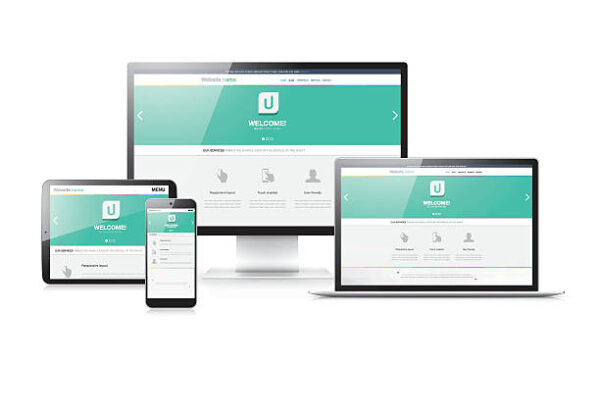
Responsive design is an approach to web design and development that aims to create websites that adapt and respond to different screen sizes, resolutions, and devices. It ensures that the website provides an optimal viewing experience, regardless of whether it is accessed on a desktop computer, laptop, tablet, or mobile phone.
Here are some key considerations and techniques for implementing responsive design:
Fluid Grids: Instead of using fixed pixel-based layouts, use relative units like percentages or ems to create flexible and fluid grids. This allows the layout to adjust proportionally based on the screen size.
Media Queries: Media queries enable you to apply different styles and layouts based on specific conditions, such as screen width, orientation, and resolution. By using media queries, you can customize the presentation of content for different devices.
Flexible Images: To ensure images scale and adapt to different screen sizes, use CSS techniques such as setting the max-width property to 100% or using the srcset attribute to provide different image sources based on the device’s pixel density.
Breakpoints: Define breakpoints in your CSS code where the layout and design need to change to accommodate different screen sizes. Common breakpoints are often based on popular device widths, such as 320px (mobile), 768px (tablet), and 1024px (desktop).
Mobile-First Approach: Start designing and developing for mobile devices first and then progressively enhance the design for larger screens. This approach ensures that the core content and functionality are prioritized for mobile users.
Flexible Typography: Use relative font units (such as ems or rems) instead of fixed pixel values for font sizes. This allows the text to adjust proportionally based on the screen size.
Navigation and Menus: Consider how the navigation and menus will adapt to smaller screens. Options include collapsible menus, off-canvas menus, or using icons or buttons to toggle the visibility of the navigation.
Testing and Debugging: Test your website on various devices and screen sizes to ensure that the design and layout respond as expected. Use browser developer tools or online testing services to simulate different devices and screen resolutions.
Performance Optimization: Optimize your website’s performance by reducing file sizes, minifying CSS and JavaScript, and leveraging techniques like lazy loading for images. This is particularly important for mobile devices with limited bandwidth and slower connections.
User-Centered Design
User-centered design (UCD) is an approach to designing products, systems, and experiences that focuses on understanding and addressing the needs, goals, and preferences of the end users. It involves actively involving users throughout the design process and prioritizing their perspectives and feedback.
are the key principles and steps involved in user-centered design:
Understand User Needs: Begin by conducting user research to gain insights into the target audience. Use techniques such as interviews, surveys, and observation to understand their goals, tasks, preferences, and pain points.
Define User Personas: Create user personas that represent different user groups or segments. Personas help designers empathize with users and make informed design decisions based on their characteristics, motivations, and behaviors.
User Journey Mapping: Map out the user’s journey and interactions with the product or system. Identify touchpoints, pain points, and opportunities for improvement throughout the user’s experience.
Design Iteratively: Adopt an iterative design approach, where you create prototypes or wireframes early in the process and gather user feedback. Continuously refine and improve the design based on user input and testing.
Usability Testing: Conduct usability testing with real users to evaluate the usability and effectiveness of the design. Observe users as they interact with the product and gather feedback on areas that need improvement.
Accessibility Considerations: Ensure that the design is accessible to users with disabilities. Follow accessibility guidelines and incorporate features such as alternative text for images, keyboard navigation support, and clear visual indicators.
Iterative Feedback Incorporation: Incorporate user feedback and iterate on the design based on the insights gained from usability testing and user observations. This ensures that the final design aligns with user needs and expectations.
Consistency and Familiarity: Design interfaces that are consistent and familiar to users. Use established design patterns, such as consistent navigation menus or standard iconography, to create a sense of familiarity and ease of use.
Clear and Simple Language: Use clear and concise language in your designs, avoiding jargon or complex terminology. Ensure that instructions, labels, and error messages are easy to understand, helping users accomplish tasks without confusion.
Continuous Evaluation: Monitor the performance and usage of the designed product or system after launch. Gather feedback from users, track analytics, and make improvements based on user behavior and evolving needs.
Visual Hierarchy

Visual hierarchy refers to the arrangement and presentation of elements in a design to convey their relative importance and guide the user’s attention. It involves using various design techniques to create a clear and organized structure that allows users to easily navigate and understand the content.
Here are some key principles and techniques related to visual hierarchy:
Size: Larger elements tend to attract more attention than smaller ones. Use size variations to emphasize important elements and create a visual distinction between different levels of importance.
Contrast: Contrast helps create visual separation and draws attention to specific elements. Contrast can be achieved through differences in color, brightness, texture, or typography. Use high contrast between important elements and their surroundings to make them stand out.
Color: Colors have different psychological associations and can be used to create a visual hierarchy. Bright, saturated colors or contrasting color combinations can draw attention, while muted or monochromatic colors can create a more subtle visual distinction.
Typography: Font choices, font sizes, and text formatting can contribute to visual hierarchy. Use larger and bolder fonts for headings or important text, and use smaller and lighter fonts for less important content. Varying font sizes, weights, and styles can help guide the user’s attention.
White Space: White space, also known as negative space, is the empty space around and between elements. It provides visual breathing room and helps establish a clear hierarchy. Use ample white space around important elements to give them prominence and separate them from less important content.
Alignment and Proximity: Elements that are aligned or grouped together tend to be perceived as related. Use alignment and proximity to visually connect related elements and separate unrelated ones. Aligning elements along a common axis or using consistent spacing helps create a sense of order and structure.
Imagery and Visual Cues: Images, icons, or graphical elements can be used to create visual focal points and draw attention. Use relevant and compelling imagery to highlight important concepts or actions. Arrows, lines, or other visual cues can guide the user’s eye along a desired path or hierarchy.
Typography Hierarchy: Use a consistent hierarchy in typography to guide users through the content. Headings, subheadings, and body text should have distinct styles and sizes to indicate their relative importance. A clear typography hierarchy helps users scan and understand the content easily.
Progressive Disclosure: If a page contains a lot of information, consider using techniques such as accordions or tabs to reveal content progressively. This allows users to focus on the most relevant information first and explore further if desired.
Readability and Typography
Readability and typography are crucial aspects of web design that greatly impact how users perceive and interact with your content.
Here are some key considerations for enhancing readability and effectively using typography:
Font Selection: Choose fonts that are legible and appropriate for the content and target audience. Sans-serif fonts like Arial or Helvetica are commonly used for online content due to their simplicity and readability. Serif fonts like Times New Roman can work well for large blocks of text in print.
Font Size: Use an appropriate font size that ensures readability across different devices and screen sizes. A general guideline is to set the body text to a minimum of 16 pixels (or equivalent em/rem units) for comfortable reading. Consider using responsive font sizes to adapt to different screen sizes.
Line Spacing: Provide sufficient line spacing (leading) to improve readability. Too little spacing can make the text feel cramped, while too much can disrupt the flow. Aim for a line spacing of around 1.4 to 1.6 times the font size, but adjust based on the font and design.
Contrast: Ensure sufficient contrast between the text color and background color to make the content easily readable. Dark text on a light background or vice versa generally works well. Avoid low-contrast combinations that strain the eyes, such as light gray text on a white background.
Typography Hierarchy: Establish a clear hierarchy using typography to guide users through the content. Use larger font sizes, bolder weights, or different styles (e.g., headings, subheadings, body text) to differentiate between different levels of information. Consistency in typography helps users quickly scan and understand the structure of the content.
Paragraph and Line Length: Keep paragraphs relatively short to prevent long, intimidating blocks of text. Aim for around 50-75 characters per line for optimal reading comfort. Longer lines can make it difficult for users to track the next line and lead to slower reading speeds.
Alignment and Formatting: Align the text consistently to create a sense of order and structure. Left-aligned text is the most common and easiest to read, particularly in Western cultures. Use appropriate formatting techniques such as bold, italics, or color to emphasize important words or phrases, but avoid excessive use that can hinder readability.
Readability Testing: Conduct usability testing or gather feedback from users to evaluate the readability of your content. Pay attention to their comprehension, ease of reading, and any areas of confusion. This feedback can help identify areas for improvement.
Responsive Typography: Ensure that your typography adjusts to different screen sizes and resolutions. Use CSS media queries and relative font units (em, rem) to create responsive typography that scales appropriately. This helps maintain readability and usability across various devices.
Loading Speed

Loading speed, also known as website performance, is a critical aspect of web design that greatly impacts the user experience. Slow-loading websites can frustrate users and lead to increased bounce rates.
Here are some considerations and techniques to optimize loading speed:
Minimize HTTP Requests: Reduce the number of HTTP requests required to load your website by combining CSS and JavaScript files, using CSS sprites for multiple images, and minimizing the use of external scripts and resources.
Optimize Images: Compress and optimize images to reduce their file sizes without significant loss of quality. Use appropriate image formats (JPEG, PNG, SVG) based on the content and optimize images further using compression tools or plugins.
Enable Caching: Utilize browser caching to store static resources locally on the user’s device, such as CSS files, JavaScript files, and images. This allows subsequent visits to the website to load faster by retrieving these files from the cache instead of the server.
Minify CSS and JavaScript: Remove unnecessary characters, comments, and white spaces from CSS and JavaScript files to reduce their file sizes. Minification can be done manually or through automated tools to optimize the code.
Content Delivery Network (CDN): Implement a CDN, which distributes your website’s static content across various servers worldwide. This helps deliver content to users from a server nearest to their geographic location, reducing latency and improving loading speed.
Compress Files: Enable GZIP compression on your web server to reduce the file sizes of HTML, CSS, and JavaScript files during transfer. This significantly reduces the amount of data that needs to be transmitted between the server and the user’s browser.
Optimize Code and Scripts: Write clean and efficient code to ensure smooth execution and minimize unnecessary processing. Optimize JavaScript code by reducing unnecessary loops, optimizing algorithms, and eliminating render-blocking scripts.
Prioritize Above-the-Fold Content: Load critical above-the-fold content first to provide a fast initial impression to users. Delay loading less important or non-visible content (such as images below the fold or scripts) to improve perceived loading speed.
Monitor and Analyze Performance: Continuously monitor the performance of your website using tools like Google PageSpeed Insights, GTmetrix, or WebPageTest. These tools provide insights and suggestions for optimizing loading speed.
Hosting and Server Optimization: Choose a reliable web hosting provider with good server performance and uptime. Optimize server configurations, such as enabling caching mechanisms, using server-side caching, and employing content delivery networks (CDNs) at the server level.
Call-to-Action (CTA) Placement
Strategic placement of call-to-action (CTA) elements is essential for guiding users and driving conversions on your website.
Here are some key considerations for CTA placement:
Above the Fold: Place important CTAs above the fold, meaning they should be visible without requiring users to scroll down. This ensures that users immediately see and engage with the primary action you want them to take.
Visual Contrast: Make CTAs stand out visually by using contrasting colors, bold typography, or compelling graphics. The goal is to draw attention and make the CTA easily noticeable within the surrounding content.
Proximity to Relevant Content: Position CTAs near relevant content that supports the action you want users to take. For example, if you have a CTA to download an e-book, place it near relevant text or within a blog post related to the topic.
Scannable Sections: Incorporate CTAs within scannable sections of your webpage, such as subheadings or bullet point lists. This catches users’ attention as they scan the content, increasing the likelihood of engagement.
End of Engaging Content: Place CTAs at the end of engaging content pieces, such as blog posts or product descriptions. Users who have reached the end of the content are more likely to be interested in taking the next step, so provide a clear CTA to guide them.
Sticky or Floating CTAs: Use sticky or floating CTAs that stay visible as users scroll down the page. This ensures that the CTA remains accessible and reminds users to take action even after they’ve read the content above.
Exit Intent Pop-ups: Implement exit intent pop-ups that appear when users are about to leave the website. These can be effective in capturing users’ attention and presenting a compelling offer or CTA to entice them to stay or take a specific action.
Relevant Sidebar or Navigation Placement: Consider placing CTAs in sidebars or navigation menus, especially for secondary or supplementary actions. This provides additional opportunities for users to engage with your desired actions while navigating through the website.
A/B Testing: Conduct A/B testing to experiment with different CTA placements and designs. Test variations to determine which positions and styles generate the highest conversion rates and align with user behavior on your specific website.
Navigation and Information Architecture

Navigation and information architecture are crucial components of web design that play a significant role in guiding users and helping them find information efficiently.
Here are some key considerations for effective navigation and information architecture:
Clear and Consistent Navigation: Design a clear and intuitive navigation menu that is prominently placed and easy to find. Use clear labels and consider organizing navigation items logically based on content hierarchy or user tasks. Maintain consistent navigation across the website to provide a familiar and predictable experience.
Simple and Predictable Structure: Organize your website’s content in a logical and intuitive manner. Use categories, subcategories, and hierarchical structures to group related information and make it easier for users to navigate and locate desired content.
Responsive and Scalable Design: Ensure that your navigation system is responsive and can adapt to different screen sizes and devices. Use techniques like responsive menus, hamburger icons, or off-canvas navigation to accommodate smaller screens while maintaining usability.
Breadcrumb Navigation: Implement breadcrumb navigation to show users their current location within the website’s structure. Breadcrumbs provide a trail of links, typically displayed horizontally, that represent the hierarchical path from the homepage to the current page.
Search Functionality: Include a search bar prominently on your website, especially for larger or content-heavy sites. Ensure that the search function provides relevant results and allows users to refine their searches if needed.
User-Friendly URLs: Use user-friendly and descriptive URLs that reflect the content and structure of the page. A clear URL structure not only aids navigation but also helps with search engine optimization.
Sitemap: Provide a sitemap that outlines the website’s structure and provides a comprehensive overview of all the pages and sections. This helps users navigate and locate specific content quickly.
Information Hierarchy: Establish a clear hierarchy within the content itself. Use headings (h1, h2, etc.) to structure content, prioritize important information, and guide users through the page. This hierarchy enhances scannability and helps users find what they need more easily.
Contextual Navigation: Consider incorporating contextual navigation within the content itself. This can include links or related content suggestions that guide users to relevant pages or sections within the website.
User Testing and Iteration: Conduct usability testing and gather user feedback to evaluate the effectiveness of your navigation and information architecture. Observe how users navigate through your website, identify any pain points, and make iterative improvements based on their feedback.
Feedback and Response
Feedback and response are essential aspects of web design that help create a positive user experience and improve the overall effectiveness of a website.
Here are some key considerations for incorporating feedback and response mechanisms:
Visual Feedback: Provide visual cues or feedback to users when they interact with elements on the website. For example, change the appearance of buttons or links when they are hovered over or clicked to indicate that an action has been triggered.
Form Validation: Implement real-time form validation to provide immediate feedback to users when they fill out forms. Highlight errors or missing information as users enter data, helping them correct mistakes before submitting the form.
Loading Indicators: Display loading indicators or progress bars when users perform actions that require time, such as submitting forms or loading dynamic content. These visual cues reassure users that their action is being processed and help manage their expectations.
Error Messages: Provide clear and descriptive error messages when users encounter errors or validation issues. Explain the problem in plain language and provide guidance on how to correct the error.
Success Messages: Display success messages or notifications when users successfully complete an action, such as submitting a form or completing a purchase. Positive feedback reinforces users’ actions and provides a sense of accomplishment.
Confirmation Dialogs: Use confirmation dialogs sparingly to ensure users have a chance to confirm or cancel important actions that have significant consequences. These dialogs help prevent accidental or irreversible actions.
Response Time: Aim for fast response times to user actions, such as loading pages, processing form submissions, or providing search results. Slow response times can lead to user frustration and a negative experience.
User Surveys and Feedback Forms: Incorporate user surveys or feedback forms to gather feedback on the user experience. Provide users with the opportunity to share their thoughts, and suggestions, and report any issues they encounter.
Social Media Integration: Integrate social media channels or other communication platforms to allow users to provide feedback or contact you directly. Monitor these channels and respond promptly to user inquiries or comments.
Continuous Improvement: Actively analyze user feedback, identify recurring issues or pain points, and make iterative improvements to address them. Regularly assess the user experience, collect analytics, and use insights to optimize your website’s performance and responsiveness to user needs.
Testing and Iteration
Testing and iteration are critical components of the web design process that help refine and improve the user experience. By gathering feedback, identifying issues, and making iterative improvements, you can create a more effective and user-friendly website.
Here are some key considerations for testing and iteration:
Usability Testing: Conduct usability tests with representative users to observe how they interact with your website. Observe their behavior, gather feedback, and identify areas of confusion, inefficiency, or usability issues. Usability testing can be done through in-person sessions, remote sessions, or using specialized usability testing tools.
A/B Testing: Implement A/B testing by creating multiple variations of a webpage or design element and testing them simultaneously with different user segments. Analyze the performance and user response to each variation to determine the most effective design or content.
Analyze User Behavior: Utilize analytics tools to gather data on user behavior, such as page views, time on page, click-through rates, and conversion rates. Analyze the data to identify patterns, understand user preferences, and discover areas for improvement.
Heatmap Analysis: Use heatmap tools to visualize user interaction on your website. Heatmaps provide insights into where users click, scroll, and spend the most time. Analyzing heatmap data can help identify popular areas, bottlenecks, or areas that need more attention.
Accessibility Testing: Test your website for accessibility compliance using automated tools and manual checks. Ensure that your website is accessible to users with disabilities by following WCAG (Web Content Accessibility Guidelines) guidelines and addressing accessibility issues identified during testing.
Cross-Browser and Device Testing: Test your website across different web browsers (e.g., Chrome, Firefox, Safari) and devices (desktop, tablet, mobile) to ensure consistent performance and compatibility. Check for any layout or functionality issues specific to different environments.
Performance Testing: Evaluate and optimize your website’s performance by conducting load testing and stress testing. Use tools to simulate high user traffic or heavy loads to identify performance bottlenecks and optimize loading speed and responsiveness.
Iterative Design: Incorporate user feedback and insights gathered from testing into your design process. Make incremental improvements based on the feedback to address usability issues, enhance functionality, and improve the overall user experience.
Collaboration and Documentation: Involve stakeholders, designers, developers, and other team members throughout the testing and iteration process. Document the findings, feedback, and proposed changes to ensure everyone is aligned and informed of the improvements being made.
Continuous Improvement: Web design is an ongoing process. Regularly monitor and analyze user feedback, track analytics, and stay updated on industry trends and best practices. Use this information to continuously refine and optimize your website to meet user needs and expectations.
Discover more from Wits Technologies Ltd
Subscribe to get the latest posts sent to your email.
- Checklist: Monthly Website Maintenance for Peak Performance

- LinkedIn Ads vs Instagram Reels: Where Should You Invest in 2025?

- The Death of Cookies; What Digital Marketers Need to Do Now

- How AI is Revolutionizing Automated Web Maintenance

- Fix It Before It Breaks: Preventive Maintenance Strategies for Websites
