Designers are increasingly recognizing the importance of incorporating emotional elements into their designs to create more engaging and memorable user experiences. By understanding and leveraging emotional design principles, they aim to forge stronger connections between users and the products or services they interact with.
Here are several ways designers are infusing emotional elements into their designs:
Color Psychology
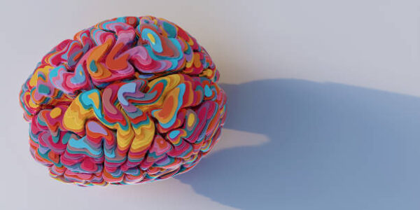
Color psychology is the study of how colors influence human behavior, emotions, and perceptions. In design, it’s a crucial aspect as it can profoundly impact the way people perceive and interact with a product, brand, or environment.
Here’s a breakdown of some common colors and the emotions or associations they tend to evoke:
Red: Associated with energy, passion, and urgency, red can evoke strong emotions. It can also signify danger or excitement. Red is often used to grab attention, create a sense of urgency, or stimulate appetite (common in food industry branding).
Blue: Often associated with trust, security, and serenity. It’s a calming color, used frequently in technology, healthcare, and finance to evoke a sense of reliability and professionalism.
Yellow: Symbolizes happiness, optimism, and warmth. It’s a vibrant color that can stimulate mental activity and is often used to grab attention or create a cheerful atmosphere.
Green: Associated with nature, growth, and health. It’s a color that can represent tranquility, balance, and harmony. Green is often used in brands related to organic products, environmental initiatives, or finance to symbolize stability.
Purple: Represents luxury, sophistication, and creativity. It’s often associated with royalty and can evoke a sense of mystery or spirituality.
Orange: Symbolizes enthusiasm, energy, and creativity. It’s a color that can create a friendly and inviting atmosphere.
Black: Often associated with sophistication, elegance, and authority. It can also convey a sense of power or seriousness.
White: Signifies purity, simplicity, and cleanliness. It’s often used in minimalist designs or to create a sense of spaciousness and simplicity.
The impact of color can vary based on cultural differences, personal experiences, and context. In design, color psychology is used strategically to evoke specific emotions or actions. For example:
Call-to-action buttons: Red or orange might be used to provoke urgency or action.
Healthcare or security brands: Blue or green are often chosen to create a sense of trust and reliability.
Children’s products: Bright and playful colors like yellow or primary colors might be used to convey energy and happiness.
Typography and Fonts

Typography and fonts play a crucial role in design as they contribute significantly to the overall aesthetics and readability of content. Beyond their visual appeal, they also carry emotional connotations and influence how users perceive and interact with a design.
Here’s how typography and fonts contribute to emotional elements in design:
Legibility and Readability: The right font choice can significantly impact how easy it is for users to read and understand the content. Good legibility leads to a more comfortable reading experience, which can influence the emotional response of the user. A clear and legible font can create a sense of ease and comfort.
Consistency and Branding: Using consistent typography across various brand materials fosters a sense of coherence and familiarity, which contributes to trust and brand recognition. Consistent use of typography helps in solidifying the brand’s identity and emotional association.
Usability and Accessibility
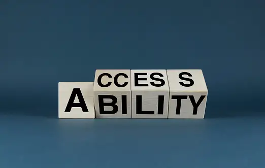
Usability and accessibility are key components in design that greatly impact the user experience and contribute to the emotional elements of a design.
Here’s how they intersect and influence emotional engagement:
Usability: Good usability is about creating designs that are intuitive, easy to use, and efficient, resulting in a positive user experience. When users can seamlessly navigate through a website or an app, find what they need, and accomplish tasks without frustration, it fosters positive emotions like satisfaction, confidence, and trust.
Clear Navigation: Intuitive navigation structures and menus that are easy to understand contribute to a sense of control and ease. Users feel more in command and confident when they can easily find their way around a design.
Efficiency and Speed: Designs that are optimized for speed and efficiency evoke positive emotions such as a sense of productivity and accomplishment. Users appreciate designs that respect their time.
Accessibility: Accessibility involves creating designs that can be used by people of all abilities. It’s not just about compliance with standards but also about inclusivity and making the design usable by a wider range of users. When a design is accessible, it creates a sense of inclusivity, care, and empathy.
Inclusivity: Designing with accessibility in mind shows a commitment to making the design available to all users, regardless of their physical or cognitive abilities. This evokes positive emotions and builds a sense of goodwill towards the brand or service.
Ease of Use for All: Creating designs that accommodate various needs—such as larger fonts for better readability, clear color contrasts for better visibility, or providing alternative text for images—contributes to a sense of thoughtfulness and consideration for all users.
Emotional Impact: Usability and accessibility directly influence the emotional response of users. A frustrating or inaccessible design can lead to negative emotions like frustration, confusion, or even exclusion. Conversely, a well-designed, accessible interface that considers the diverse needs of users contributes to positive emotional responses, such as satisfaction, trust, and a sense of belonging.
Discover more from Wits Technologies Ltd
Subscribe to get the latest posts sent to your email.
- Checklist: Monthly Website Maintenance for Peak Performance

- LinkedIn Ads vs Instagram Reels: Where Should You Invest in 2025?
- The Death of Cookies; What Digital Marketers Need to Do Now
- How AI is Revolutionizing Automated Web Maintenance

- Fix It Before It Breaks: Preventive Maintenance Strategies for Websites
